From John Rubino of DollarCollapse.com:
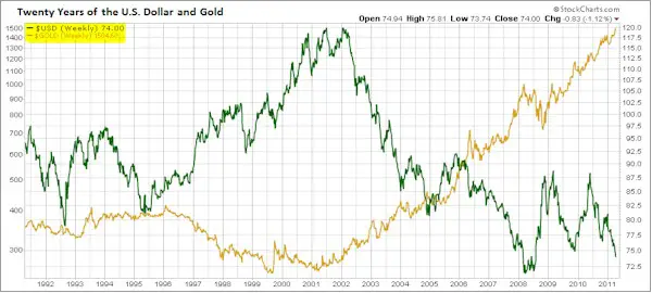
This chart appeared in a recent Business Insider article, and even without explanation it’s a powerful illustration of gold’s bull market. Remember those stomach churning “corrections” of years past? They’re insignificant squiggles when viewed this way. Something to keep in mind during the next 10% dip.

But the dollar’s path (the green line) requires a little thought. It’s clearly down, but doesn’t seem to be falling as consistently and dramatically as gold is rising. Why is that? Because the dollar in being measured against other currencies — which are also falling in real terms — so the destruction of the euro and yen are masking the dollar’s decline. In other words, all the major currencies are being inflated away, with the dollar just slightly ahead of the ugly pack.
Gold, meanwhile, doesn’t “rise” or “fall”. It holds its value while the currencies in which it is valued fluctuate. So this chart actually depicts two ways of measuring the dollar. The green line is versus other currencies, which is a false measurement because it explains nothing about the real trajectory of the dollar. The gold line is the inverse of the dollar’s true value, as measured against the only remaining real form of money. Seen this way, gold’s rocking bull market is actually the dollar’s epic bear market. Neither is likely to end anytime soon.